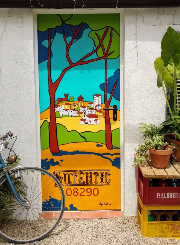
“We want to add an illustration to our label. Replace the current draw, so much technical, for something closer and warmer.” During our conversation I notice that the most important thing is that the illustration must be able to define their land, and the product. It also has to be elegant to notice the quality of the product. I decide to visit their vineyards. Finally, we decide to do the labels with all the elements surrounding their land and the wine taste: aromatic plants, red fruits and slate, specially licorella. Some of them with a Catalan tiles look.